Let us generate data and plot from few examples of probability
distributions. In general, any given distribution dist in R
is defined by four functions rdist, pdist,
ddist, and qdist, which correspond to the
sampling, the CDF, the density (or mass) and the quantile functions,
respectively. For example, the Normal distribution is defined by the
four functions rnorm, pnorm,
dnorm, and qnorm.
Example of standard normal distribution
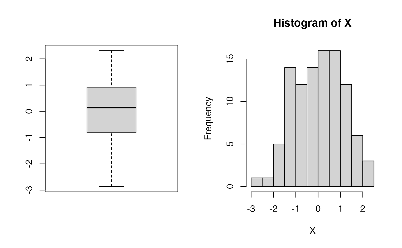
Let us generate a sample (X) of 100 points from a standard normal (mean 0 and stdev 1); visualize it as a boxplot and a histogram.
Let us now generate a second sample (Y) of points that are linearly related to the first sample (based on the linear equation \(y = 1 + 2*x + \epsilon\), with \(\epsilon \sim N(0,1)\).
Y <- 1 + 2*X + rnorm(N)
plot(X,Y,pch=20)
abline(1,2,col="red") # plot a line with intercept 1 and slope 2
abline(h=0,lty=3)     # show the origin
abline(v=0,lty=3)     # ..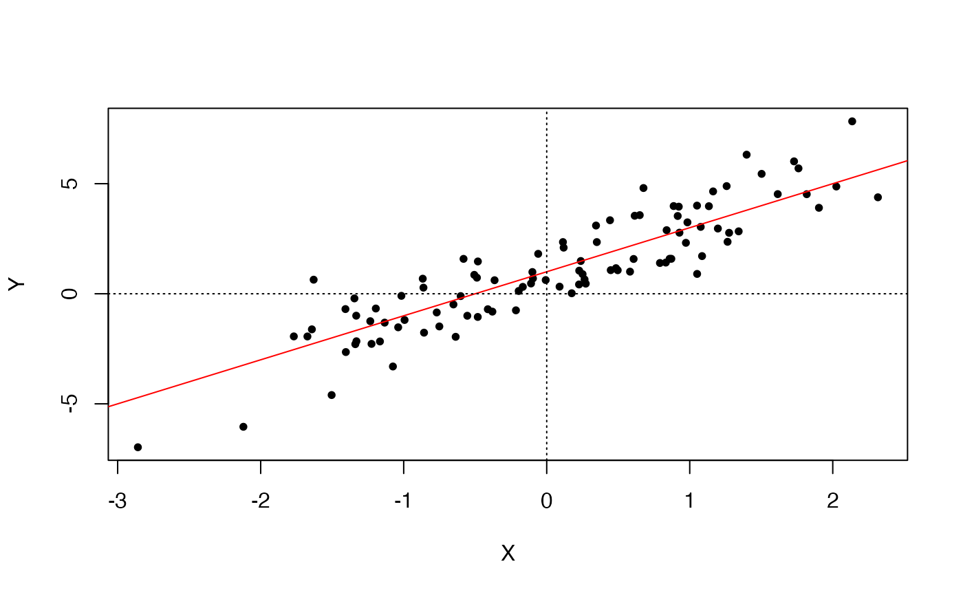
Let us see how good a linear model would be at “guessing” the generating model.
##
## Call:
## lm(formula = Y ~ X)
##
## Residuals:
##     Min      1Q  Median      3Q     Max
## -2.4115 -0.8641 -0.2037  0.9665  3.2093
##
## Coefficients:
##             Estimate Std. Error t value Pr(>|t|)
## (Intercept)   0.9483     0.1161   8.168 1.11e-12 ***
## X             2.1591     0.1074  20.099  < 2e-16 ***
## ---
## Signif. codes:  0 '***' 0.001 '**' 0.01 '*' 0.05 '.' 0.1 ' ' 1
##
## Residual standard error: 1.159 on 98 degrees of freedom
## Multiple R-squared:  0.8048, Adjusted R-squared:  0.8028
## F-statistic:   404 on 1 and 98 DF,  p-value: < 2.2e-16
plot(X,Y,pch=20)
# the "true" line
abline(1,2,col="red") # plot a line with intercept 1 and slope 2
# the fitted line (based on the 100 observations)
abline(lmY$coefficients[1],lmY$coefficients[2],col="blue",lty=3)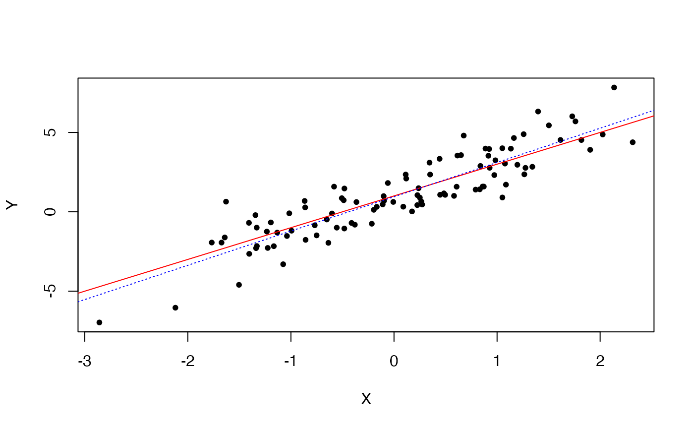
Pretty good. And if we were to increase the sample size, the “guessing” (read, the estimation) would get better and better.
Let us now plot the well-known bell-shaped curve and the corresponding CDF.


A simple distribution plot function
Notice that in the above code, the points plotted are evenly spaced, which is not optimal, since we would like to have higher resolution where most of the density lies. Furthermore, we need to a-priori know where most of a distribution mass lies, so as to generate an adequate set of X coordinates. Otherwise, we might end up with a truncated plot, as shown in the examples below.


To take care of this, we can define a slightly more sophisticated distribution plotting function, using information about a distribution’s quantiles.
plot.distn <- function(qfun, dfun, n, type="l", lty=1, add=FALSE, xlab=NULL, ylab=NULL, main=NULL, col="black", silent=TRUE, ...)
{
  p <- (1:(n-1))/n
  q <- qfun(p,...) # generate the set of X-coordinates based on the distribution quantiles

  if ( add )
    lines( q, dfun(q,...), lty=lty, col=col )
  else
    plot( q, dfun(q,...), type=type, lty=lty, col=col, xlab=xlab,ylab=ylab,main=main )

  ## this is useful to determine plot boundaries
  if (!silent) return ( c(0,max(dfun(q,...))) )
}
Normal (or Gaussian) distribution
Now we can plot a histogram of 1000 data points drawn from a standard (i.e., mean=0, stdev=1) Normal (or Gaussian) distribution.

If we want the histogram to show frequencies (i.e., numbers in the
0-1 range), rather than counts, so that we can superimpose the density
contour (using the function plot.distn), we can use the
argument probability=TRUE
hist(X1,probability=TRUE)
plot.distn(qnorm,dnorm,n=1000,add=TRUE)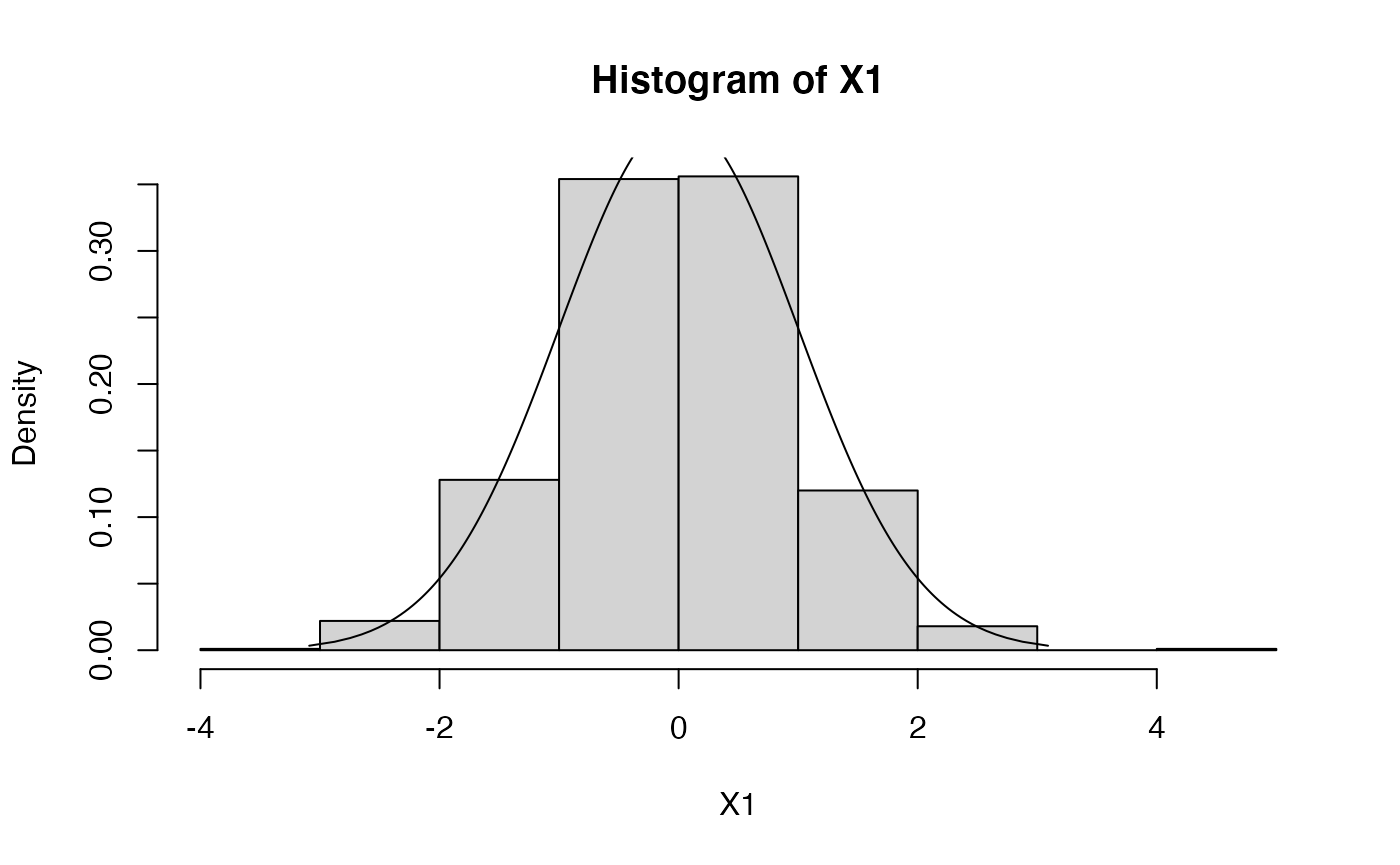
# let's increase sample size to increase histogram resolution
X1 <- rnorm(1000000,mean=0,sd=1)
hist(X1,probability=TRUE)
plot.distn(qnorm,dnorm,n=1000,add=TRUE)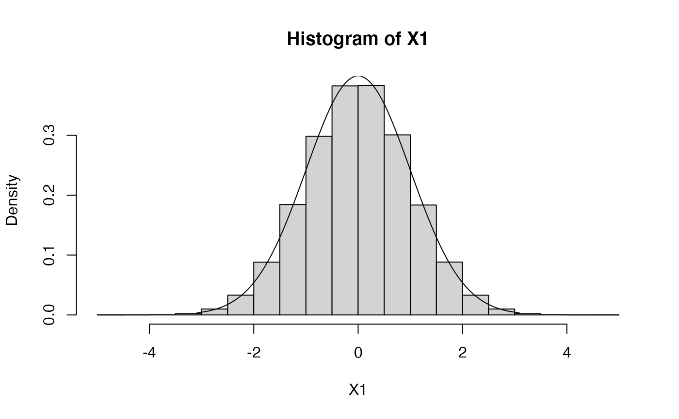
Log-Normal distribution
Let’s plot from a log-normal distribution.
N <- 1000 # number of datapoints
X2 <- rlnorm(N,meanlog=0,sdlog=1)
hist(X2,probability=TRUE)
plot.distn(qlnorm,dlnorm,n=N,add=TRUE,meanlog=0,sdlog=1)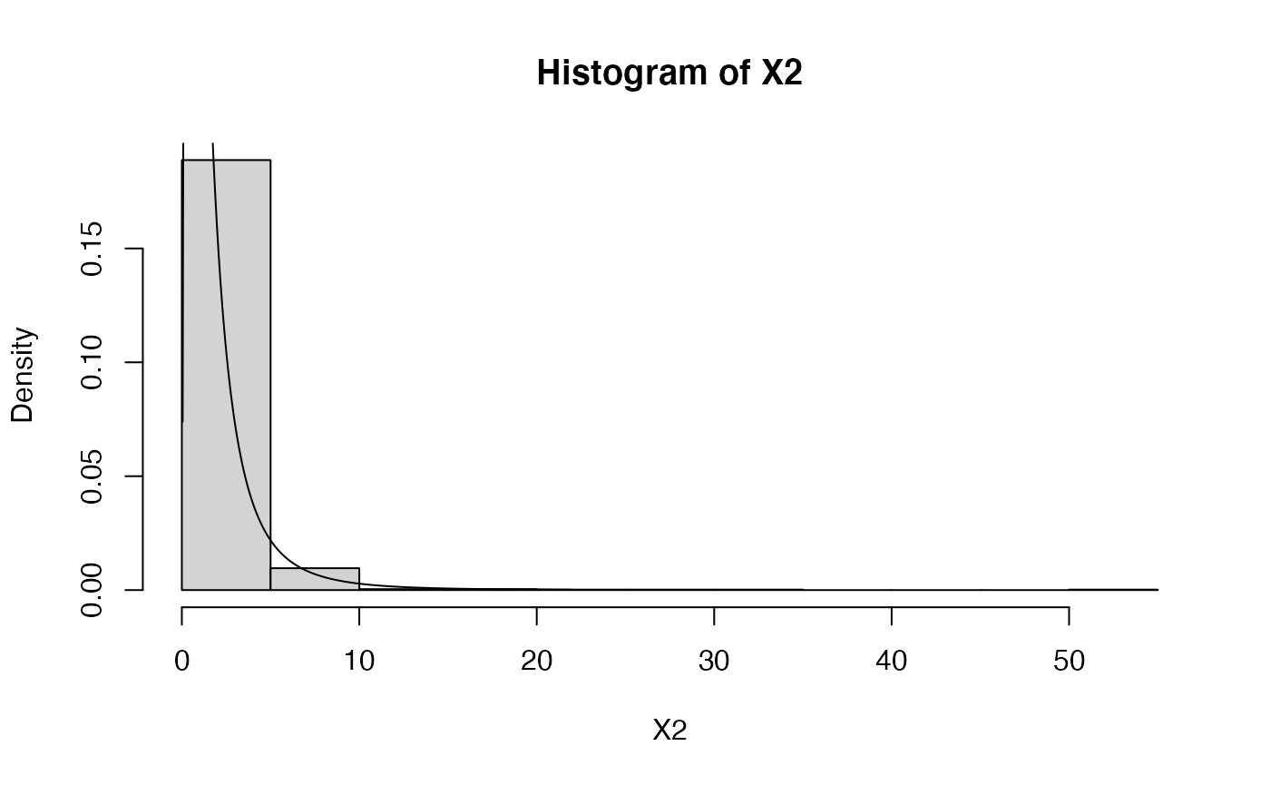
# the plot is truncated. Here's a fix (won't always work)
plot.distn(qlnorm,dlnorm,n=N,meanlog=0,sdlog=1)
hist(X2,probability=TRUE,add=TRUE)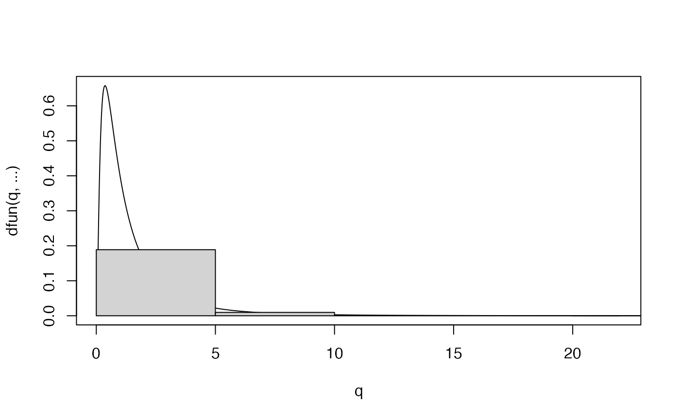
# a log-normal distribution yields data whose logarithm is normally distributed
X1 <- rnorm(N,mean=0,sd=1)       # remember X1 ~ N(0,1)
qqplot(X1,log(X2),main='qqplot') # plot it against X2 ~ log-N(0,1)
abline(0,1,col="red")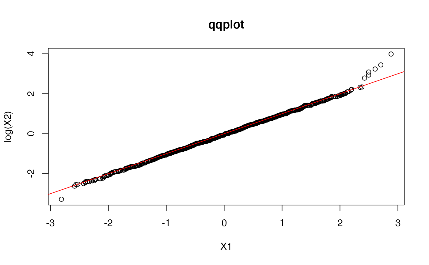

## let's see how different means and standard deviations look like ...
X2 <- rlnorm(N,meanlog=0,sdlog=0.5)
plot.distn(qlnorm,dlnorm,n=10*N,meanlog=0,sdlog=0.5,ylab="dlnorm(q,...)")
hist(X2,probability=TRUE,add=TRUE)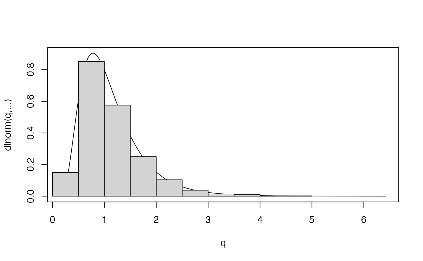
plot.distn(qlnorm,dlnorm,n=10*N,meanlog=0,sdlog=0.5,ylab="dlnorm(q,...)")
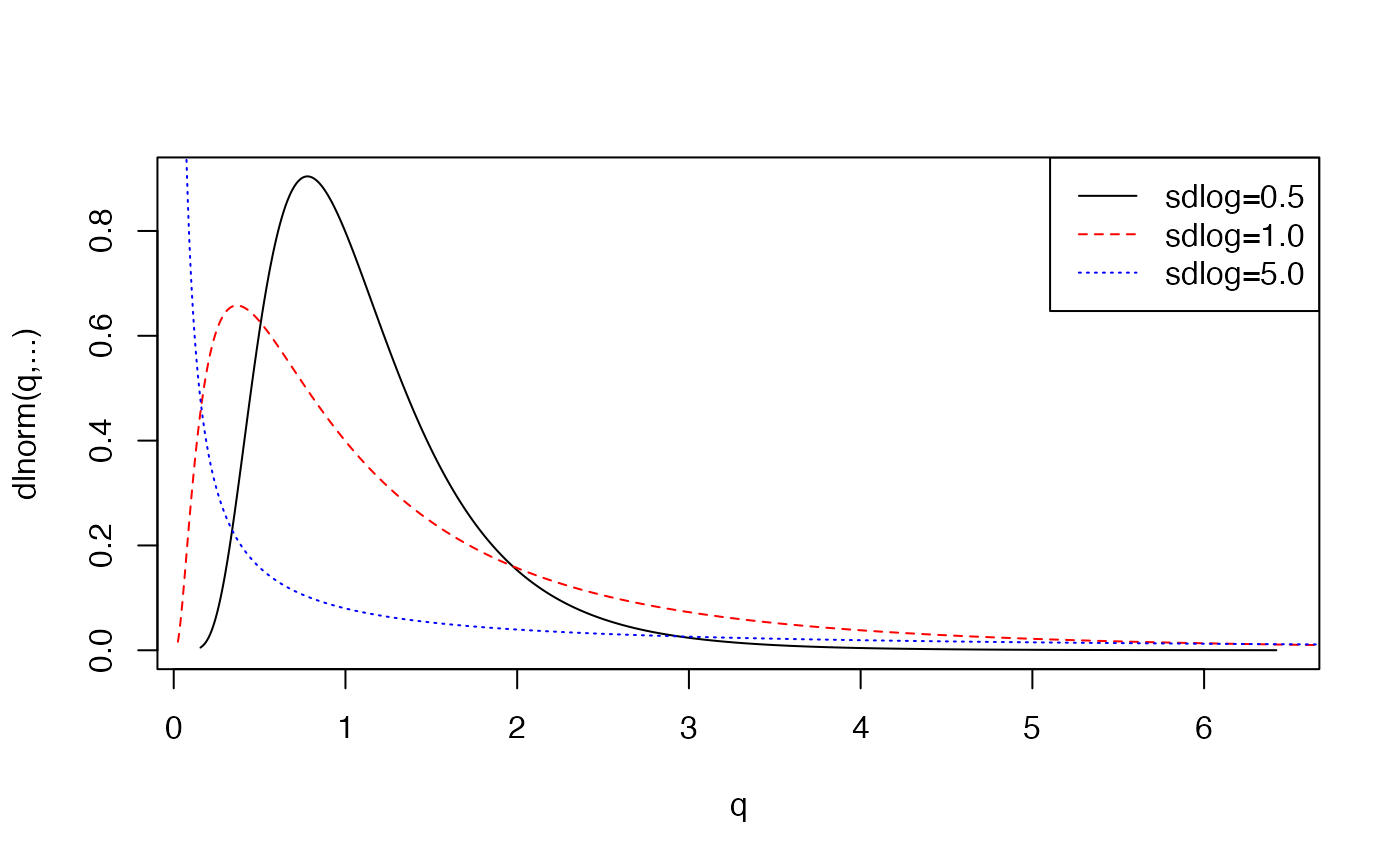
plot.distn(qlnorm,dlnorm,n=10*N,meanlog=0,sdlog=1.0,ylab="dlnorm(q,...)",add=TRUE, col='red',lty=2)
plot.distn(qlnorm,dlnorm,n=10*N,meanlog=0,sdlog=5.0,ylab="dlnorm(q,...)",add=TRUE, col='blue',lty=3)
legend('topright',col=c('black','red','blue'),lty=1:3,legend=c("sdlog=0.5","sdlog=1.0","sdlog=5.0"))